


Easy Infographic
This Easy Infographic allows users to scroll through six sections about a specific topic with a downloadable asset. The top navigation includes a CTA that will scroll the user to the bottom of the page where they can fill out a form which allows them to download an asset. Another CTA located in the hero section will scroll the user to the first section of the page to promote page fluidity. The user will encounter different content interactivity within each section and will be asked to complete a simple form, at the bottom, allowing the user to download an asset.
COMPLEXITY

Low
TYPE

Infographic
USE CASE

Engagement
Features
Here are the major features, abilities, and interactive elements used in this template.
Anchor Link
Reveal
Accordion
Flow
Animation
Form
How-To Use


.png?v=09092022212737)


.png?v=09092022021718)


Content Structure
Best Practices
- Tagging
- Conversion
- Additional Tips
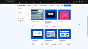
Related Template
If you like this template, you might want to check out these other similar ones.
Software & Technology
Infographic with 3 Features
Type
Infographic

Software & Technology
Grid Series Infographic
Type
Infographic
Software & Technology
Social Infographic
Type
Infographic
Software & Technology
Gated Infographic
Type
Infographic