Crawl-Walk-Run-Fly Assessment

This is an 8-question assessment with 4 choices for each question. This experience is gated, requiring users to fill out a form before accessing their results. Logic is simple: mostly “A” choices go to “1st — Crawl” result, mostly “B” choices go to “2nd — Walk” result, and so on. A custom mini-resource library section based on the user's inputs is included in the results page.

COMPLEXITY

Medium

TYPE

Assessment

USE CASE

Lead Generation

Features available

Here are the major features, abilities, and interactive elements used in this template.

Flow

Flow will allow you to build step-based interactive elements, such as Tabs, Accordions, and other elements, with great customizability. Use cases and examples of it's power are the abiltiy to create a carousel of images all the way to a one page assessment that presents one question at a time.

Form

Form will allow you to build simple to complex forms that contain different types of inputs and toggles, and can be combined with rules to create logic based results. Use cases for a Form are quizzes, assessments, calcuators, and traditional forms.

Animation

Animation will allow you to animate elements via microthemes. A use case for this would be to have a section fade up and in to a page via scroll.

Feature 5

Vestibulum ante ipsum primis in faucibus orci luctus et ultrices posuere cubilia curae; Fusce eleifend erat at augue bibendum facilisis nec a odio. Nulla facilisi. Ut nec nulla gravida, egestas lacus ac, laoreet sapien. Mauris at augue orci. Pellentesque non egestas elit. Sed consequat ex sem, cursus facilisis felis semper pharetra. Ut tempus nec metus nec laoreet.

How-to use

Here is a helpful guide on how to handle all the major features, abilities, and interactive elements available to make the most out of this template.

Place a “Container” element on your canvas as an entire section. Within this container place a “Responsive Grid” element and remove the two additional default columns. Make the column span the entire width of the row. After, place a “Flow” element within the column with five additional flow steps.

On the flow level check mark the Variables to “Fixed Height” and “Scroll to Top on Step Change”.

Place a “Form” element within the flow step. On the form level, in the “Layout” panel add bottom margin 1em.

Place a “Choice Group” element within the form. On the label container set the bottom margin to 2em.

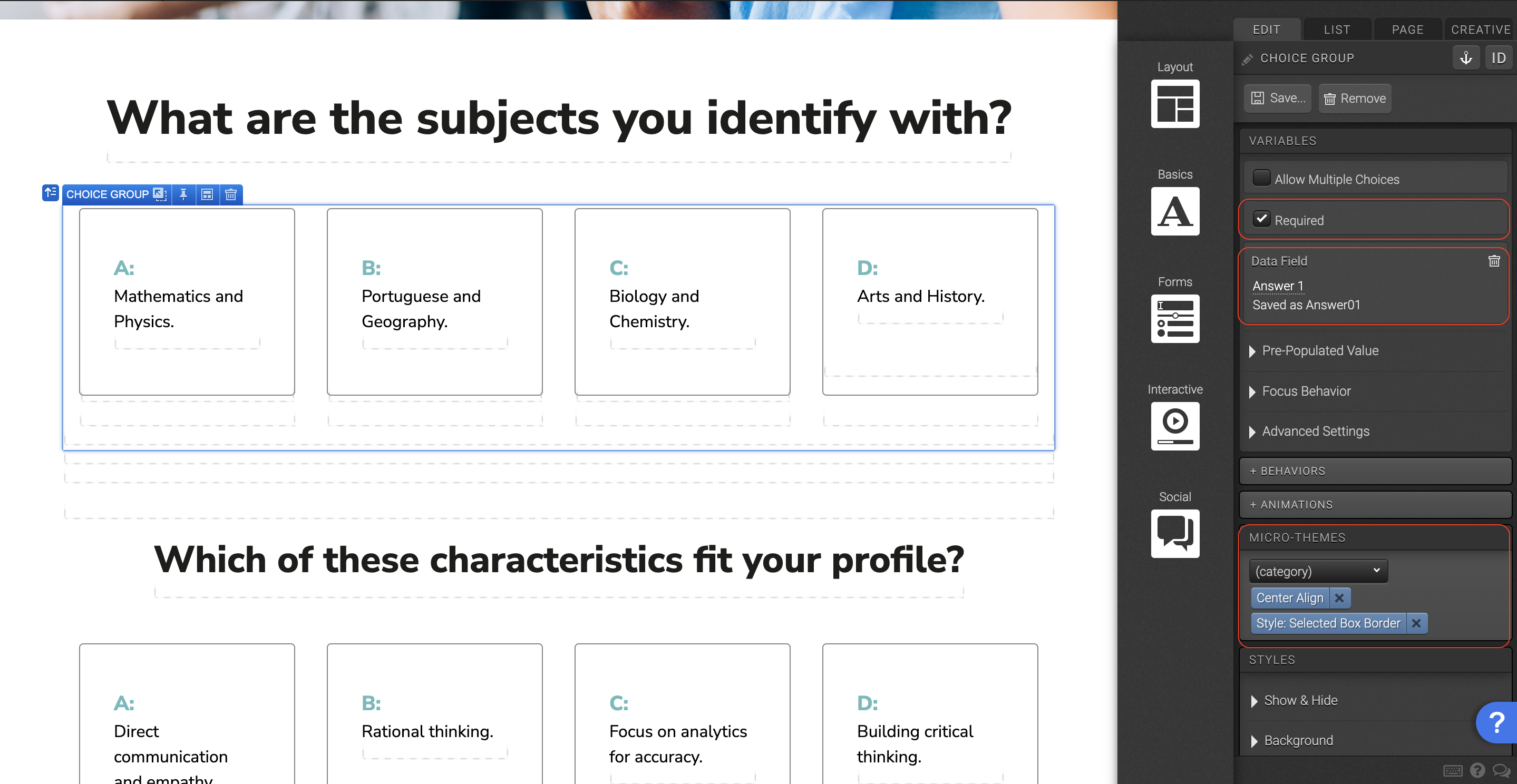
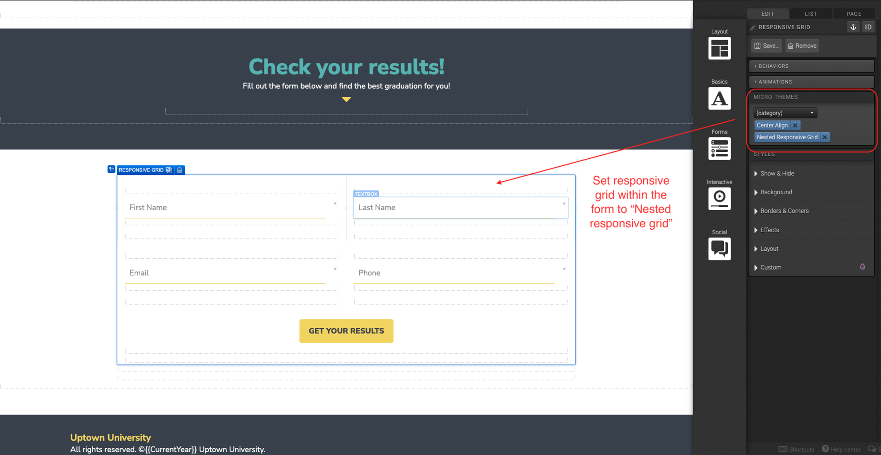
On the choice group level navigate to the Variables panel and check mark “Required”. Don’t forget to set the data field here. In the “Micro-Themes”, set the alignment to “Center Align” and in the choice group category, set the style to “Style: Selected Box Border”.

Place a “Responsive Grid” element within the choice group. In the “Micro-Themes” within the “Grid Layout” category, select “Nested Responsive Grid”.

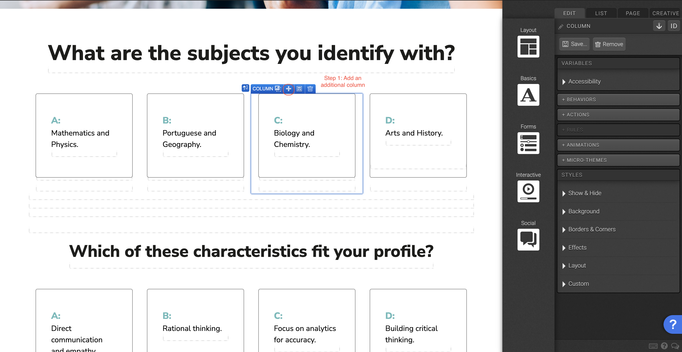
Add an additional column to the responsive grid within the choice group. Change the row settings so that all columns have the same width. Here you can also change the row setting for different viewports, to make the assessment responsive in multiple screen sizes.

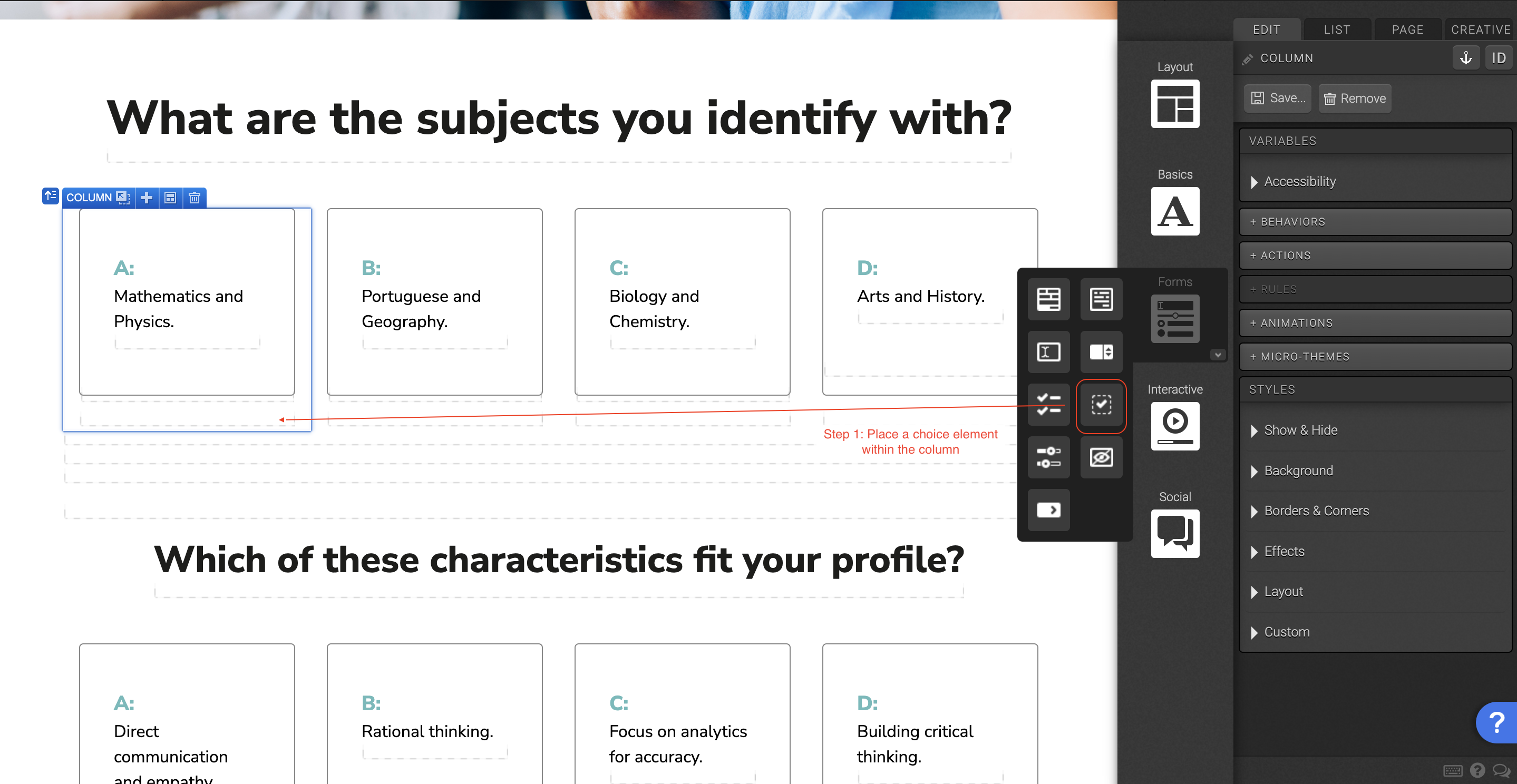
Place a “Choice” element within each column. In the Variables panel give the choice a “Data Value”, and set the Default Selection to “Unselected”. In the Behaviors panel, set the “Behaviors in Flow” to move to next, and the “Behaviors in Form” to validate and submit. In the Layout panel add 15px bottom margin, and 25px left and right padding.

Place a container within the choice. In the “Micro-Themes”, select the category “Pods” and set it to transparent.

Place two text elements within the container inside the choice.

Place a container section on the canvas. Place a responsive grid within the container. Set the first and last column to be one column wide, and the middle column ten column wide.

Place a “Form” element in the middle column. Then place a Responsive Grid within the form element. In the "Micro-Themes" set the responsive grid to “Nested Responsive Grid” in the Grid Layout category. Add an additional row to the responsive grid and remove the third column. Make both columns the same width.

Place a “Textbox” element into each of the columns. Remove the default label text.

With the textbox element selected, navigate to the Variables panel. Set the input type to reflect the type of information the field will be collecting from the user, ex. Phone number. Set a data field name, and placeholder text.

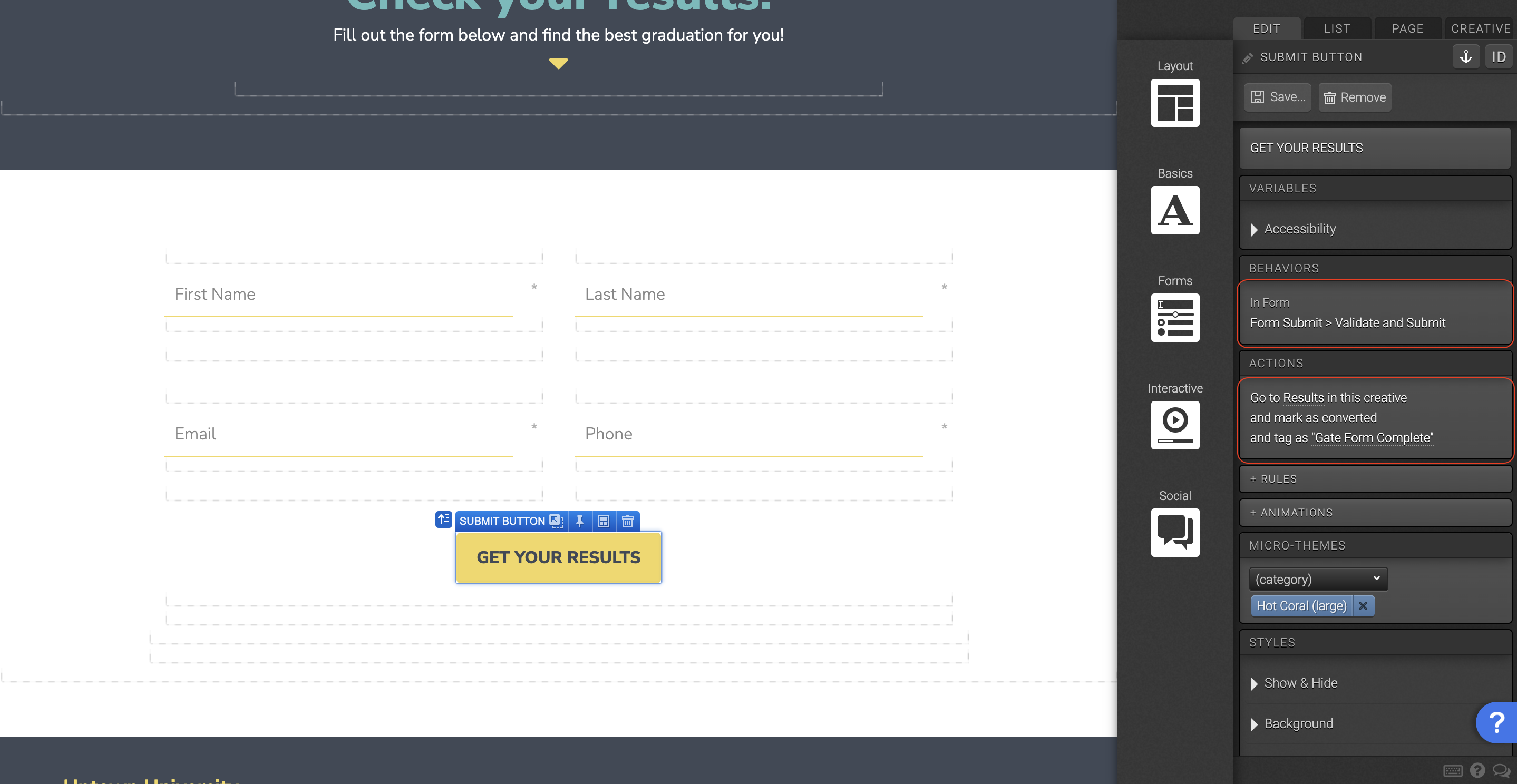
With the submit button selected, set the “Behaviors in form” to validate and submit, and set the action to the next page the user is supposed to see after completing the form. *You can also set the submit button to be “marked as converted”. Many people will use a form for the purpose of gathering information and tracking.

Place a container section on the canvas. Place a responsive grid within the container. On the column, add 1em bottom margin in the “Layout” panel.

Add a “Container” element within the column. In the “Micro-Themes” add a transparent pod, and in XS viewport remove the fixed height. Add a background image in the background panel and check mark “Responsive Background Image”. Give the container 2em padding and a height of 18em.

Place another “Container” element within the container. Give this container a height of 10em in the “Layout” panel. This is for the XS viewport.

Place another “Container” element within the first container in the column. *It will look like two containers stacked and wrapped within a larger container.

To the container in step 4, apply a pod micro-theme to it. Give this container 3px padding in the “Layout” panel, set the Display to “Inline-Block”, and set the Position to “Layered” top= 1em and left =1em.

Place a “Text” element within the step 4 container. In the “Micro-Themes” add text styling “Fine Print”.

Place a “Container” element below the container in the column. Add a pod "Micro-Theme" and set the top margin to -8em. *The structure should be: column with two containers. First container has two containers within it.

Place “Text” and “Link” elements within step 7 container. You can style the text and links using the "Micro-Themes" colors, buttons, links, and etc.

Select the element on the page you would like the user to be scrolled too. Navigate to the top right of the elements panel, and select the anchor. Give the anchor a unique name.

Navigate to the element that will take users to the anchored element. In the “Behaviors” panel select the anchor name.

Content structure

Here is the content structure’s template to make it easier for you when providing content guidelines or creating the copy for this template, from understanding the content structure to getting to know the amount of words needed to each text piece.
Preview Content Writing TemplateOpens in a new window.

Best practices

Be sure to tag everything that is "taggable" so that you are able to review everything at a later time in your reports.

Reveals
Flows
Flowsteps
Links
Tabs
Accordions
Lightboxes
Rotators
Sliders

Your conversion point is the most important measurement in determining whether your creative is converting visitors. We recommend having one conversion point per creative. Here is the element and methods in which to set your conversions:

Links
Behaviors
Actions

Before going live with your experience, you want to run a final proofing process. This will review the experience as a whole, with any final revisions necessary. Here is the most important items to be reviewed before GoLive:

  • Review of any integrations
  • Review of conversion point
  • Review of tagging
  • External links are working correctly (opening in a new window)
  • Mark respondents as always new if used for conference or live event
  • Uncheck the robot meta directives (no archive, no follow, no index)
  • Remove path description (if applicable)
  • Make sure traffic source has been added to social share — og URL, twitter (create bit.ly), email share
  • Once live, debug on Facebook (if applicable)

Related templates

If you like this template, you might want to check out these other similar models.

Have a question?

Still have questions or are facing troubles when handling this template? Please do not hesitate to send any additional questions, so we can make sure to have this page constantly up to date.