Savings Calculator

This Savings Calculator is a 3 question calculator containing choices with iconography and a slider that are all wrapped in a flow keeping the user on a single page and moving vertically from question to question. It has a hero section, and below there is a reveal section that shows more content when hovered over. The assessment below has choices that change color when hovered over and a slider with a range in dollar value. This calculator is also a gated experience with a form before taking the users to the result page. The results page displays results based on the user’s selections, and additional resources below.

COMPLEXITY

Expert

TYPE

Calculator

USE CASE

Lead Generation

Features available

Here are the major features, abilities, and interactive elements used in this template.

Flow

Flow will allow you to build step-based interactive elements, such as Tabs, Accordions, and other elements, with great customizability. Use cases and examples of it's power are the abiltiy to create a carousel of images all the way to a one page assessment that presents one question at a time.

Reveal

Reveal will allow you to create two-state interactive content. A use case for this would be an information tooltip, where in one state an information icon is seen but when hovered or clicked on, a second state is shown displaying the tooltip text.

Form

Form will allow you to build simple to complex forms that contain different types of inputs and toggles, and can be combined with rules to create logic based results. Use cases for a Form are quizzes, assessments, calcuators, and traditional forms.

How-to use

Here is a helpful guide on how to handle all the major features, abilities, and interactive elements available to make the most out of this template.

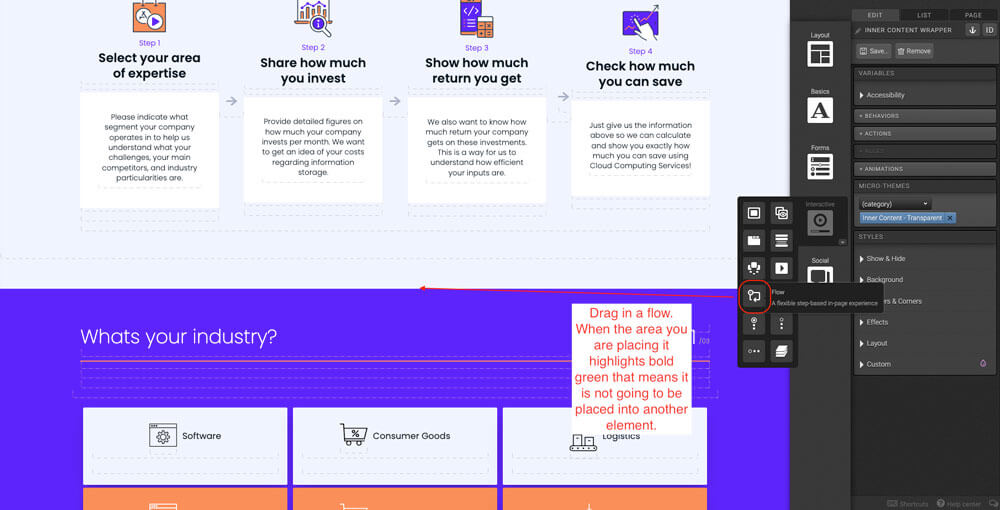
Place a flow on the canvas. This flow should go below all other sections set up above. If you are placing the flow between two sections, when dragging you want the entire canvas to highlight light green, drag to the middle point until you see a darker green line show up; that's where the flow should go.

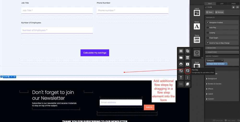
By default there will be three flowsteps added to the flow but feel free to add more if your calculator requires more questions. Within the flowstep, add a responsive grid. Use your right arrow key to go down to the row level, select how you would like to display the responsive grid in different viewports. Feel free to add more columns into the grid for your calculator. For this template, one column for the questions and labels and another row below with three columns.

Within the first column, place a form element. Within the form element, place a responsive grid and go to the micro-theme under grid layout and select the “nested responsive grid”.

Place a responsive grid, delete the two additional columns leaving one. Change the row settings so it displays according in large, medium, small, and x-small viewports.

Place a container within the column. In the layout panel apply a width percentage, display ‘inline-block’, and vertical alignment ‘middle’.

Place a reveal into the container that is inside the column. Set the reveal type to ‘toggle’, Reveal when ‘hovered’, check mark ‘conceal other reveals’, and position ‘top left’. *Don’t forget to also tag the reveal.

In the reveal trigger, place a container. Within that container, place an image and text. On the container level apply the Micro-Theme alignment ‘Center Align’ and Animation ‘Fade In (Scroll Always)’.

In the reveal container, place a container within it. Apply the Micro-Theme ‘White pod’ and Alignment ‘Center Align’. The Place text within the inner container.

In the reveal level copy the reveal and paste it in the 3 other containers that are inside the column. To make the arrow transition, place a container inside the column level.

To make the arrow transition, place a container inside the column level. Then place an arrow icon within the container. Finally, duplicate the container containing the arrow 2 times. Drag the container in between the containers containing the reveals. It will highlight bold green, you will know that you’re placing it in the middle of two elements. 

Place a form in a single column spanning the entire row. Place a responsive grid within the form. Don’t forget to set in the Micro-Themes ‘Nested Responsive Grid’. Remove the additional third column added by default. Set your row settings to even in large and medium viewports.

Drag in a Textbox element and place it within the column inside the form.

Give this element a label, data field, input type, number settings, and pre-populated values. Copy the Textbox into the columns 5 times.

Logic template

Here is the logic’s template and quick video tour to make it easier for you when handling this template, from overviewing the rules, to understanding the formulas, to editing the logic or equations as necessary.
Preview Logic TemplateOpens in a new window.Watch Logic Video TourOpens in a new window.

Content structure

Here is the content structure’s template to make it easier for you when providing content guidelines or creating the copy for this template, from understanding the content structure to getting to know the amount of words needed to each text piece.
Preview Content Writing TemplateOpens in a new window.

Best practices

Be sure to tag everything that is "taggable" so that you are able to review everything at a later time in your reports.

Reveals
Flows
Flowsteps
Links
Tabs
Accordions
Lightboxes
Rotators
Sliders

Your conversion point is the most important measurement in determining whether your creative is converting visitors. We recommend having one conversion point per creative. Here is the element and methods in which to set your conversions:

Links
Behaviors
Actions

Before going live with your experience, you want to run a final proofing process. This will review the experience as a whole, with any final revisions necessary. Here is the most important items to be reviewed before GoLive:

  • Review of any integrations
  • Review of conversion point
  • Review of tagging
  • External links are working correctly (opening in a new window)
  • Mark respondents as always new if used for conference or live event
  • Uncheck the robot meta directives (no archive, no follow, no index)
  • Remove path description (if applicable)
  • Make sure traffic source has been added to social share — og URL, twitter (create bit.ly), email share
  • Once live, debug on Facebook (if applicable)

Related templates

If you like this template, you might want to check out these other similar models.

Have a question?

Still have questions or are facing troubles when handling this template? Please do not hesitate to send any additional questions, so we can make sure to have this page constantly up to date.