


Healthcare Landing Page
This engaging and resourceful landing page template breaks down large content into different visual displays. In the hero section of the Healthcare Landing Page, you will notice micro-animations, information displayed in a flow, and a Lead Gen capturing opportunity through the form. As visitors scroll through the experience, they will notice additional resources for speciality health care, odometer counters, reveals that change color on hover, flow navigation with icons displaying additional content and a google imported map. Visitors are encouraged to navigate this experience and discover different ways content can be displayed.
COMPLEXITY

Medium
TYPE

Landing Page
USE CASE

Lead Generation
Features available
Here are the major features, abilities, and interactive elements used in this template.
Custom Code
Flow
Form
Animation
How-to use


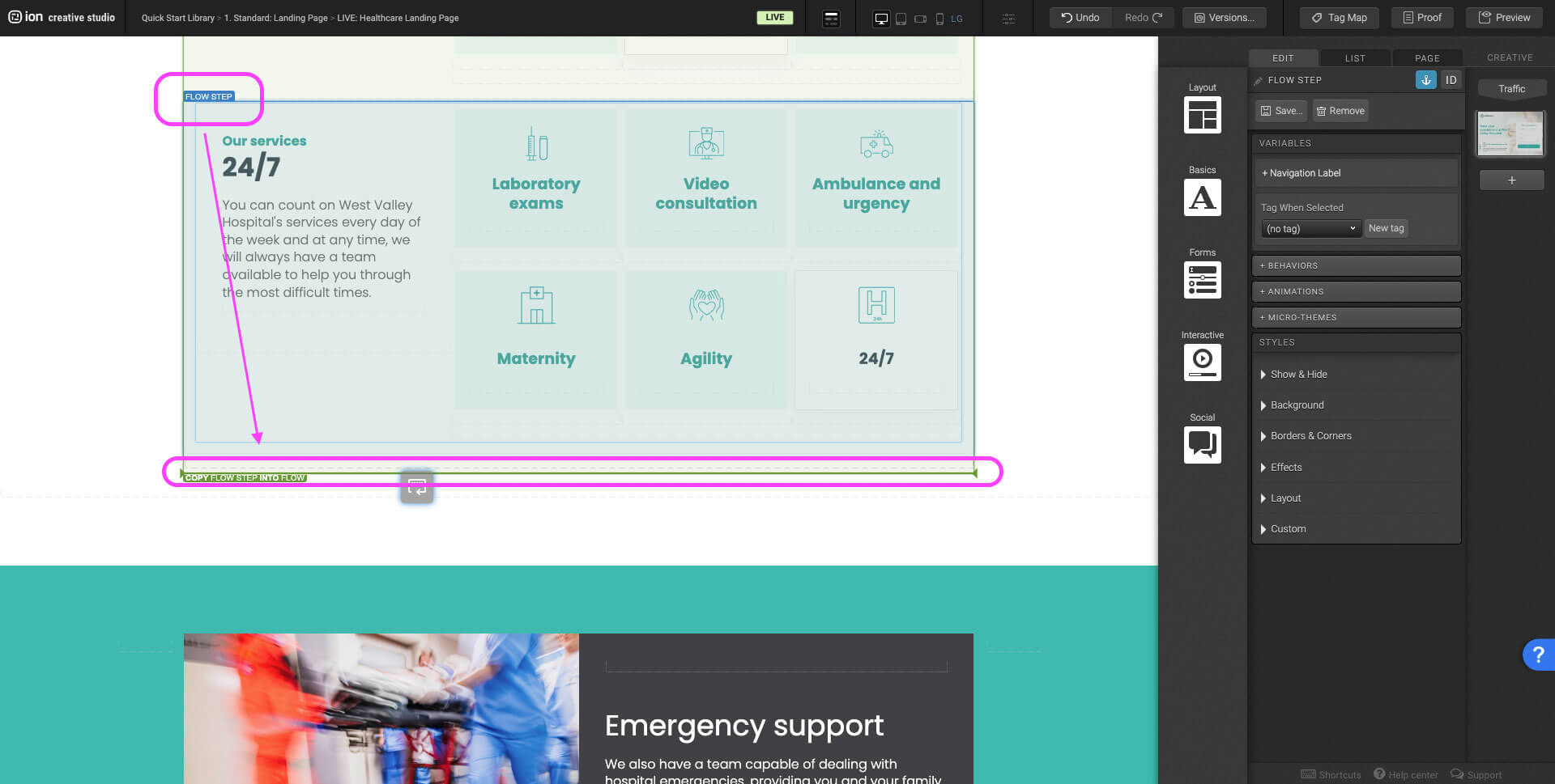
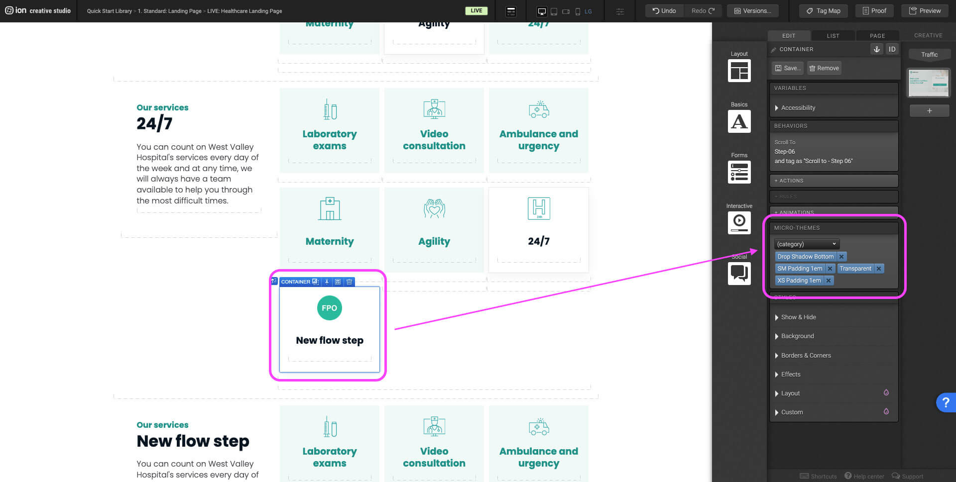
Select the last flow step within the Flow. Hold the alt key on Windows or options on Mac and drag the flow step until the Flow highlights green. The bold green bottom border on the flow indicates that it will duplicate into the Flow. You can alternatively select the flow step, press Ctrl+C or Command+C then navigate to the flow and press Ctrl+V or Command+V.


Content structure
Best practices
- Tagging
- Conversion
- GoLive
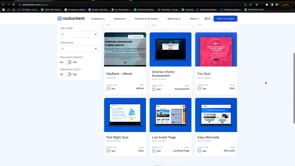
Related templates
If you like this template, you might want to check out these other similar models.
Construction Landing Page
Type
Landing Page

Logistics Landing Page
Type
Landing Page
Manufacturing Landing Page
Type
Landing Page
App Tour
Type
Microsite