Interactive Components

Ion offers a variety of interactive components that can help you streamline the building process and increase visitor engagement on your interactive experience. These components are based on the structure and sections that are commonly found on web pages, including Ion’s gallery of templates, and may incorporate interactive elements such as Flows, Forms, Accordions, Tabs, and so forth, or even advanced visual layouts utilizing custom code.

Speed

Create a complete and more engaging interactive experience for your visitors in a fraction of the time it would take to build everything from scratch.

Engagement

Easily create dynamic and intriguing experiences that will keep your visitors engaged from the header to the footer of your pages.

Conversion

Turn interactive components into embeddable microexperiences to help in increasing conversions and moving the audience down the funnel.

Types of Components

Here’s the major categories and types of interactive components organizing the library.

Header

The Header category offers a range of pre-constructed headers designed to make it easy for visitors to navigate the experience and take desired actions. Options include simple headers with a logo and CTA button, traditional headers featuring a navigation bar, and advanced headers incorporating features like lightboxes and centered layouts. No matter which header you choose, you can be confident that it will help your visitors easily find their way around and take the next steps you want them to.

Hero

The Hero category features pre-built hero sections that grab the visitor's attention and encourage them to scroll down the page. These sections typically include a title, description, and CTA button, but can also include visually striking elements such as image slideshows, background videos, and interactive forms. By creating a clear statement and engaging the visitor's interest, these hero sections help to drive the overall user experience.

Content

The Content category is the most comprehensive, offering a range of pre-built sections for the main body of your experience. These include sections for About Us, Features, Services, Quiz Questions, and Resources, among others. By carefully placing these sections on your page, you can create a highly engaging and visually appealing interactive experience that will guide your visitors towards a conversion point with a high probability of success. Overall, the Content category provides the tools you need to build a seamless and effective user journey.

Post-content

The Post-content category is a crucial aspect of the overall user experience, where you can encourage your visitors to take action, such as moving to the next page, learning more, making a purchase, downloading something, or filling out a form. These pre-built sections are specifically designed to help your visitors take the next step and become successful conversions. Whether you want to guide them towards a purchase or simply encourage them to explore more of your site, the Post-content category provides the sections you need to drive engagement and conversions.

Footer

The Footer category offers pre-built sections that help to enhance long pages that may require some scrolling to get back to the top and access the navigation. These sections may include nav links, company information, CTA buttons, and social media links. Some footer sections may contain a variety of elements, while others may focus on just a few key features. Whether you need a simple or complex footer, this category has something to suit your needs.

Post-footer

The Post-footer category features pre-constructed sections with a range of layouts for displaying copyright and legal information. These sections provide a convenient and visually appealing way to present this important information to your visitors, helping to establish trust and credibility while keeping your page in compliance with your business guidelines.

Custom Code (Advanced)

The Advanced category includes pre-built sections with advanced functionality that can help experienced users elevate their Creative to the next level. These sections incorporate custom code like JavaScript and CSS to create animations, visual effects, and customized functionality that goes beyond what's available through Ion's native features. These include, blurred results, side scrolling, odometer text, and much more. If you're an experienced Ion user and are looking to add extra flair and functionality to your interactive experience, this category is for you.

How-to use

Here is a helpful guide on how to add an interactive component from a different template to your current creative.

From within Creative Studio click on the plus button below the page thumbnails on the far right of the browser window.

Select the Cloud: Microexperiences Gallery from the Quick Start Source dropdown, choose your category from the Quick Start category dropdown and choose your Creative from the Quick Start Creative dropdown.

Select the component container on the canvas and using your keyboard press and hold down CTRL/CMD + C to copy the component.

Go to the page where you want to add the component, select the container or location where you want to paste your copied component and then press and hold down CTRL/CMD + V to paste the component.

Delete New Page by clicking on the Creative name in the top left bread crumbs to be taken back to the Creative screen, then click on the three dots button below the thumbnail title and click Delete this Page, lastly click on Delete this Page button in the popup window that appears to confirm.

How to add an interactive component to your creative

Here is a short video on how to enrich your current creative with an interactive component from a different template.
Watch Video TutorialOpens in a new window.

How to create an experience using interactive components

Here is a tutorial showing how to create a single page experience by just using components from multiple templates.
Watch Video TutorialOpens in a new window.

Best practices

Be sure to tag everything that is "taggable" so that you are able to review everything at a later time in your reports.

Reveals
Flows
Flowsteps
Links
Tabs
Accordions
Lightboxes
Rotators
Sliders

Your conversion point is the most important measurement in determining whether your creative is converting visitors. We recommend having one conversion point per creative. Here is the element and methods in which to set your conversions:

Links
Behaviors
Actions

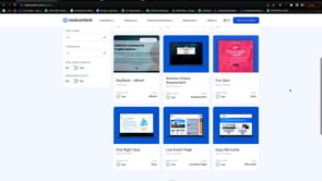
Interactive component examples

If you like this interactive component, you might want to check out these other similar elements.

Have a question?

Still have questions or are facing troubles when handling this documentation? Please do not hesitate to send any additional questions, so we can make sure to have this page constantly up to date.