Plan Finder

Powered with a modern and sleek design, this solution finder is built to help you find the best fitness plan that fits your needs. Minimalism and bold colors are the biggest players, featuring an animated hero background, stunning images and a unique checklist accordion to accommodate all your information.

COMPLEXITY

Medium

TYPE

Solution Finder

USE CASE

Sales Enablement

Features available

Here are the major features, abilities, and interactive elements used in this template.

Flow

Flow will allow you to build step-based interactive elements, such as Tabs, Accordions, and other elements, with great customizability. Use cases and examples of it's power are the abiltiy to create a carousel of images all the way to a one page assessment that presents one question at a time.

Form

Form will allow you to build simple to complex forms that contain different types of inputs and toggles, and can be combined with rules to create logic based results. Use cases for a Form are quizzes, assessments, calcuators, and traditional forms.

Animation

Animation will allow you to animate elements via microthemes. A use case for this would be to have a section fade up and in to a page via scroll.

Accordion

Accordion will allow you to organize content vertically into separate sections that expand and contract when clicked on. A use case for this would be to create a FAQ of product or service related questions, where each accordion label would have it's own questions and the answer within the accordion section.

Anchor Link

Anchor will allow you to link a section or page element to a specific link or button. A use case for this would be to place an anchor on an about section that links to the About link in the page's navigation.

Video

Video will allow you to add YouTube, Vimeo, and other video types to your creative as a standalone video element or as a video background. A use case for this would be a video auto playing in the background of a hero section container.

How-to use

Here is a helpful guide on how to handle all the major features, abilities, and interactive elements available to make the most out of this template.

Place a container on the canvas. Navigate to the Background panel. Upload the video as a background image.

*The video file should be formatted as a gif.

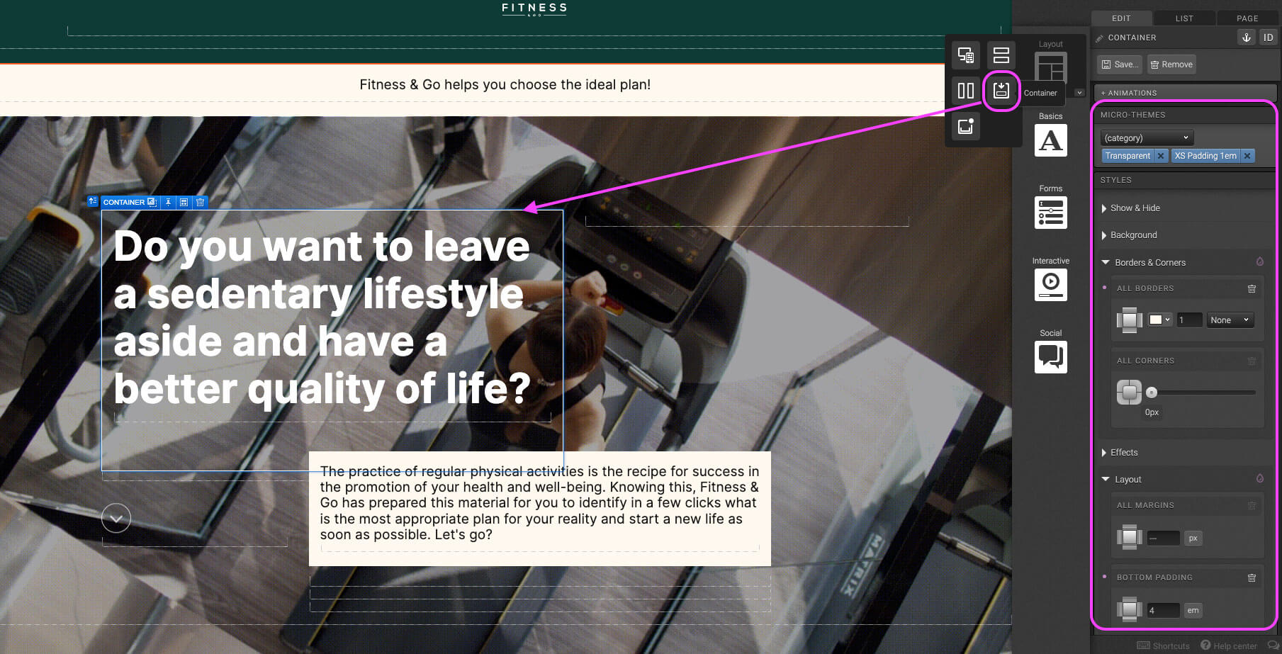
Place a container inside the step 1 container. In the Micro-Themes, set the Background to “Black Transparent Background” and Regions to “Content”. In the Layout panel, set the top and bottom padding to 8em.

*Padding can be adjusted if content copy exceeds word limit in the Content Structure document.

Place a Responsive Grid inside the container of Hero Video Background.

Adjust the row to have two columns. Column 1 is seven columns wide, and column 2 is 5 column wide.
Place a container Column 1. In the Micro-Themes set Pod to “Transparent” and Responsive Setting (XS) to “XS Padding 1em”. In the Borders & Corners panel select a color, set the thickness to 1px and in the dropdown select “Solid”. Scroll down to the Layout panel, set the bottom padding to 4em.

Place text element into Step 2 container. Add copy, and use the Micro-Themes panel to increase the font-size and change text color.

Add an additional Grid Row to the Responsive Grid in Step 1. This row should be below content in Step 2 and 3. Column 1 is three columns wide, column 2 is seven columns wide, and column 3 is two columns wide.

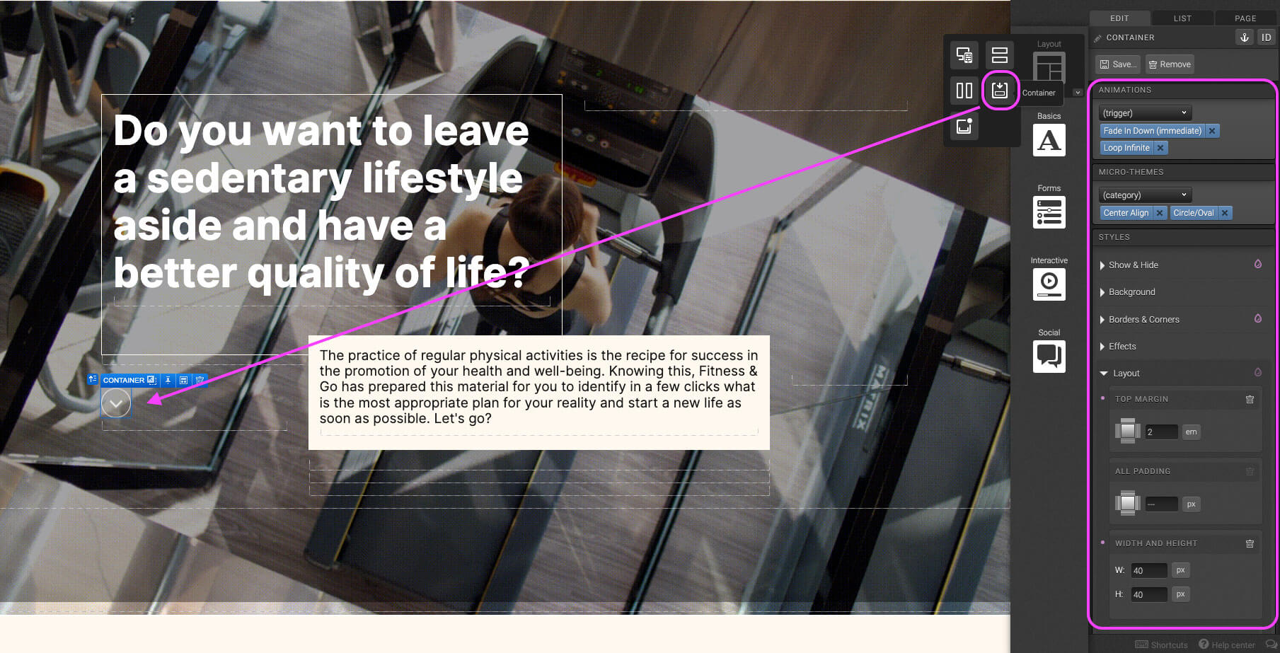
Place container into Column 1. Set Animation to Immediate “Fade In Down” and Looping Infinite. In The Micro-Themes, set alignment to “Center Align” and styling to “Circle/Oval”. In the Show & Hide, check off “Hide in XS”. Add color and 0.5px solid border in the Borders & Corners. In the Layout section, set top margin to 2em, and width and height to 40px.

With Column 2 selected, in the Micro-Themes set Responsive Settings (XS) to “XS No Margins” and “XS Padding 1em”. In the Layout panel set the top margin to -3em.

Place a container in Column 2. In the Micro-Themes select a pod, ideally one with a colored background. In the Layout panel, set the bottom margin to 4px, and padding 1em all around.

Decide where users should be sent upon clicking on a specific element. With the element selected, navigate to the top right hand side of the Edit panel and select the anchor. Give the anchor a unique name.

Select the trigger element that will send the user to destination in Step 1. Navigate to Behaviors, select Scroll to “Anchor Name” and assign a tag.

Place Flow element on the canvas. In the Micro-Themes under Flow, set “All steps: Slide Vertically” and a background color.

Navigate to the flow step level within the flow. In the Micro-Themes under Regions select “Content”. Scroll down to the Layout panel and set top padding 6em. *Don’t forget to also assign a tag to collect behavioral data from users.
*Don’t forget to also assign a tag to collect behavioral data from users.

By default Flows appear with 3 Flow steps. To add more drag in an Interactive Flow Step element placing it inside the Flow.

Place a Responsive Grid within the Flow Step. Remove the default two columns, and change the row settings so that the single column now spans the entire row.

Place container into column. In the Micro-Themes select pod “Transparent”.

Place Form element in Step 2 container. Remove the submit container including the button.

Place a Choice Group element into the form. Adjust the Variables and select the desired data field for this specific question. In the Micro-Themes under Choice Group select “Style: None”

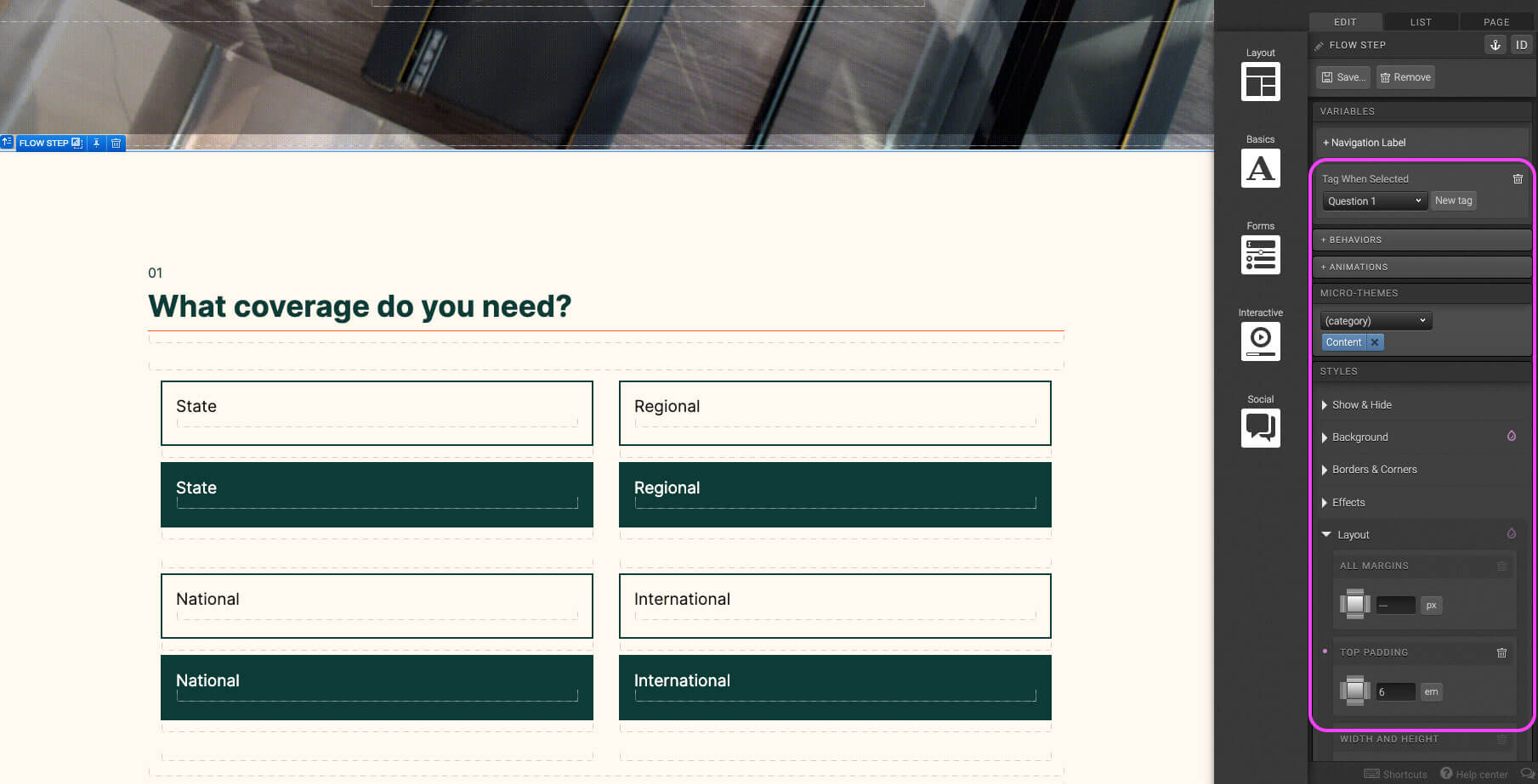
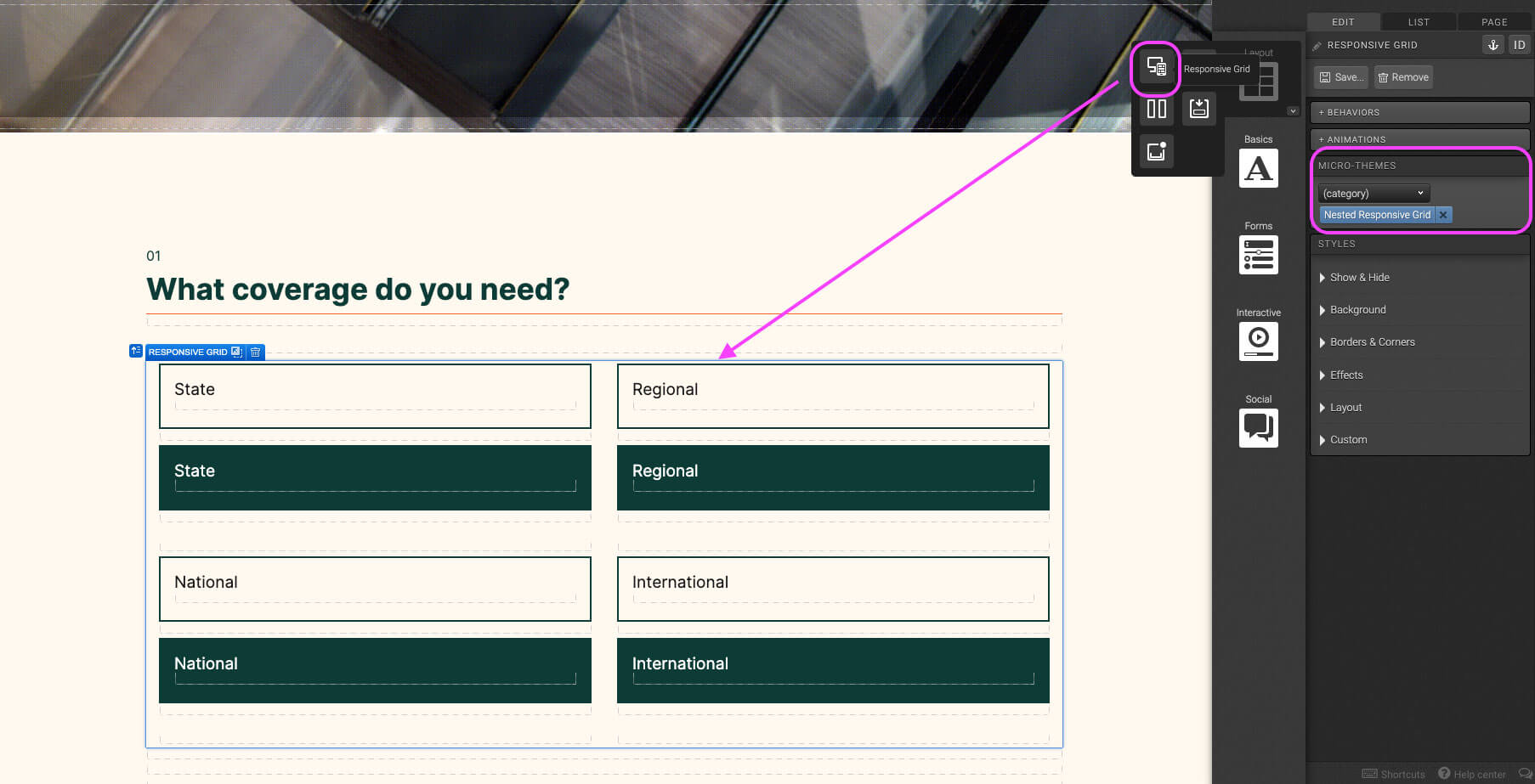
Place a Responsive Grid within the Choice Group element. In the Micro-Themes under Grid Layout select “Nested Responsive Grid”. Remove the third column and adjust the row setting to that Column 1 and 2 are six column wide. Add an additional row into the responsive grid.

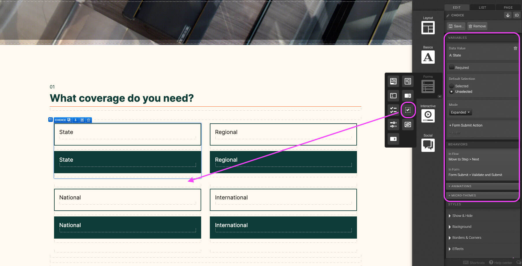
Place a Choice element in the column. Adjust the Variables and change the Mode to “Expanded”. In the Behaviors panel, set Behavior In Flow to “Move to step Next” And Behaviors in Form “Validate and Submit”. In The Layout panel set the bottom margin to 1em.

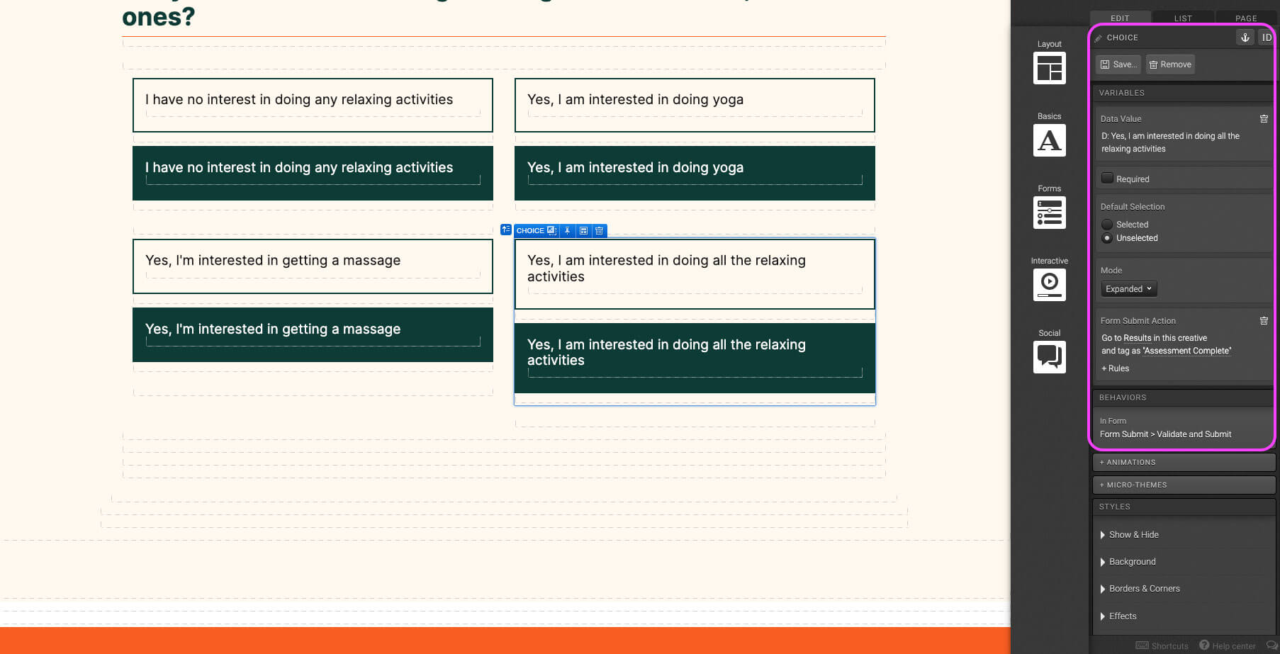
For the last question choices in the Solution Finder, don’t set the Behavior In Flow to “Move to step Next”. Instead, in the Variables panel, under Form Submit Action set the action to go to the page that users should see after the assessment is complete.

Place a container on the canvas. Give it a background color.

Place a Responsive Grid within Step 1 container. In the Micro-Themes set the Grid Layout to “Nested Responsive Grid”. Remove the third column and adjust Column 1 to be six columns wide, and Column 2 to be six column wide.

Place a container in Column 1. In the Micro-Themes set the alignment to “Left Align”, Pod to “Transparent”, and Responsive Setting (XS) to “XS Padding 1em”. In the Layout panel, set the left, top, and right padding to 6em.

Place all necessary copy text in Step 3 container. Make font-size and color adjustments using the dropdowns in the Micro-Themes. Use the Layout panel to add margin and padding.

With Column 2 selected, add a background image, and check “Responsive Background Image”. Use the Show & Hide panel to hide in the SM and XS viewport.

With Column 2 selected, adjust the height to 50em, less or more depending on the amount of copy in Column 1.

Place an Accordion element into Column 1 Step 3 container. Add accordion headline titles for each section under the Variables panel and add a tag.

Select Section 1 of the accordion. Place a container into Section 1, and add bottom margin 1em in the Layout panel.

Place text element into Step 2 container. In the text editor, display the copy in bullet format. This will ensure that bullet styling can be edited using the Micro-Themes. Add 1em bottom margin in the Layout panel.

Add another container into Step 2 container. Under Animations set to Immediate “Pull Left”, set a background color using the Micro-Themes, and 1px height under Layout panel.

Duplicate Step 2 container into the accordion section, and change copy based on the amount of bullet points to be included.

Logic template

Here is the logic’s template and quick video tour to make it easier for you when handling this template, from overviewing the rules, to understanding the formulas, to editing the logic or equations as necessary.
Preview Logic TemplateOpens in a new window.Watch Logic Video TourOpens in a new window.

Content structure

Here is the content structure’s template to make it easier for you when providing content guidelines or creating the copy for this template, from understanding the content structure to getting to know the amount of words needed to each text piece.
Preview Content Writing TemplateOpens in a new window.

Best practices

Be sure to tag everything that is "taggable" so that you are able to review everything at a later time in your reports.

Reveals
Flows
Flowsteps
Links
Tabs
Accordions
Lightboxes
Rotators
Sliders

Your conversion point is the most important measurement in determining whether your creative is converting visitors. We recommend having one conversion point per creative. Here is the element and methods in which to set your conversions:

Links
Behaviors
Actions

Before going live with your experience, you want to run a final proofing process. This will review the experience as a whole, with any final revisions necessary. Here is the most important items to be reviewed before GoLive:

  • Review of any integrations
  • Review of conversion point
  • Review of tagging
  • External links are working correctly (opening in a new window)
  • Mark respondents as always new if used for conference or live event
  • Uncheck the robot meta directives (no archive, no follow, no index)
  • Remove path description (if applicable)
  • Make sure traffic source has been added to social share — og URL, twitter (create bit.ly), email share
  • Once live, debug on Facebook (if applicable)

Related templates

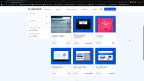
If you like this template, you might want to check out these other similar models.

Have a question?

Still have questions or are facing troubles when handling this template? Please do not hesitate to send any additional questions, so we can make sure to have this page constantly up to date.